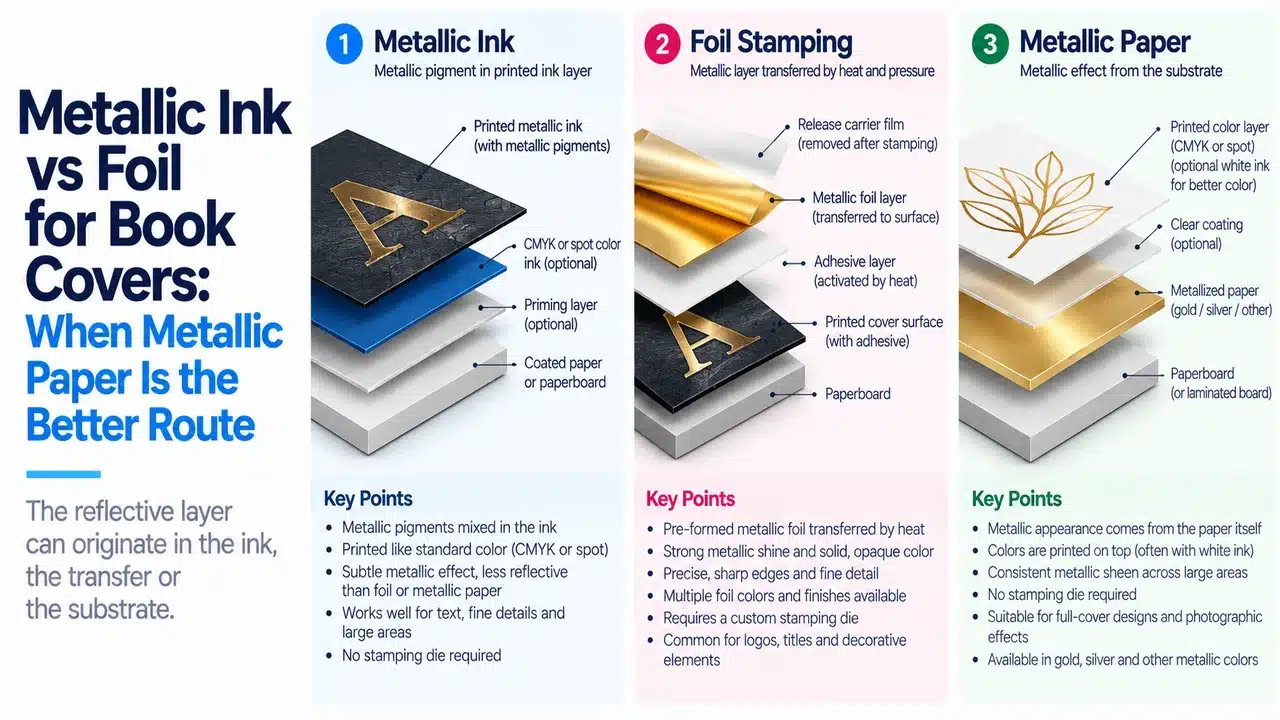
“Gold title, black cover, matte finish” is an incomplete manufacturing instruction. It leaves three decisions unresolved: where the metal effect comes from, which areas should reflect light, and what sits above that reflective layer.
When comparing metallic ink vs foil for book covers, start with the required effect. For an isolated reflective title, evaluate hot foil first. A specified metallic ink is suitable when its printed effect meets the design target. Evaluate metallic paper when reflection belongs across a large background or multiple colored regions. Calling all three “gold” leaves the production method undecided.
For a hardcover, name the component first: case covering, dust jacket or slipcase wrap. A sheet that prints well as a jacket may not be suitable for wrapping boards. Decide the effect and the component together before requesting prices.
Start with what actually makes the surface metallic
Metallic ink carries reflective pigment in the ink film. ECKART identifies both leafing and non-leafing gold and aluminum pigment systems in its METALSTAR offset and letterpress ink range. The selected formulation, printing surface and finishing system matter; “silver ink” does not identify one universal material.
Hot foil transfers a decorative layer in the shape of the stamping die. Foilco’s foil construction guide separates the carrier, release system, lacquer, metallic layer and adhesive. The carrier is a processing support, not a sheet deliberately left covering the whole book. The adhesive grade must suit the receiving surface. A reflective metallic foil and a matte pigment foil are different products even though both are stamped.
Metallic paper brings the reflective surface to the press. Printing and selective opaque white then determine where that reflection remains visible. Specify the actual paper or board construction and printable surface; the label “metallic paper” does not establish thickness, flexibility, print compatibility or recyclability.
Conventional CMYK printed on ordinary white paper can depict golden shading, but it does not add a metallic reflective layer. If the requirement is physical reflection as the cover moves, a gold-colored process simulation is a different design result, not an equivalent lower-priced production route.
| Required result | Route to evaluate first | What must be settled before purchase |
|---|---|---|
| Reflective title on a mostly nonmetallic case | Hot metallic foil | Exact foil reference, substrate, artwork and finish sequence |
| Printed shimmer in selected graphics | Metallic ink | Ink series, paper, coverage and compatibility with the finished surface |
| Reflective background with several colored metallic regions | Printable metallic paper | Stock construction, ink system, white mask and wrapping suitability |
| Gold-looking artwork without real metallic reflection | CMYK simulation | Buyer explicitly accepts a nonmetallic result |
This is a starting-route table, not a fixed gloss ranking or cost ladder. Compare nominated physical materials. A matte foil does not have to outshine a high-brilliance metallic ink, and a glossy sample does not establish performance after matte finishing.
Follow the gold title through the production sequence
Consider the black-cover brief above. This is a design scenario, not a completed customer case.
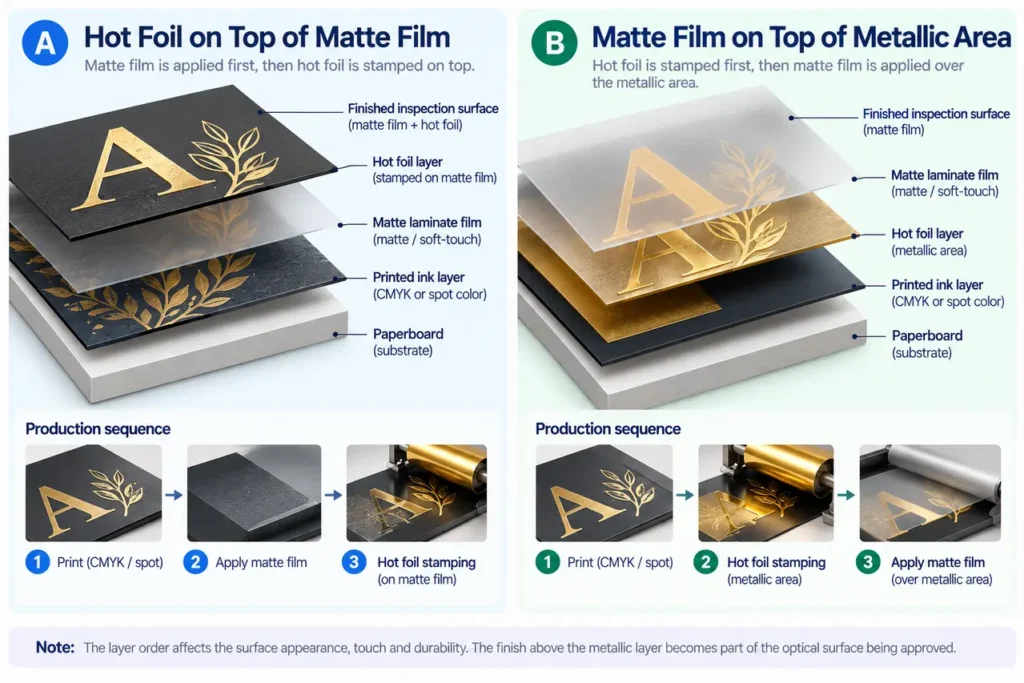
If the title must remain reflective against a matte background, one candidate is a printed black wrap with matte lamination followed by hot foil. That keeps the selected foil above the matte layer. The foil grade must be designed for that laminated surface; do not assume a grade approved on paper will bond to the film.
KURZ’s LUXOR/ALUFIN MSU guidance lists laminated and UV-coated surfaces among the applications of that particular range. That scope applies to the named range; it does not approve other foils on other laminates.
If the proposed sequence instead places matte film over the metallic area, the film becomes part of the optical surface. Compare that finished sample with the intended effect. Do not approve an exposed metallic swatch and then add an unexamined top finish to the production order.
For a cloth case, printed-paper assumptions no longer apply. The weave and coating are part of the receiving surface. PrintPack360’s cloth-bound Smyth-sewn hardcover route is relevant to a restrained foil-title design; the separate foil stamping on book cloth guide covers interrupted detail, pinholes and transfer defects. Resolve the process choice here, then use that guide for cloth-specific execution.
Ink compatibility and white backing: two manufacturer examples
“Metallic ink cannot be laminated” is too broad to use as a specification. Equally, “lamination protects it without changing the effect” is an unsupported promise unless it describes the selected ink and film.
Color-Logic describes its BEST ECO Offset Silver Ink as a first-down silver that can be overprinted with process inks. It also states that this product retains metallic lustre with aqueous or UV coating and gloss lamination. The same page restricts the branded inks to licensed printers. This is a documented product capability, not a statement that PrintPack360 uses the system or that matte and gloss film give identical results.
Request the ink reference and its permitted finishing construction. Rejecting all metallic inks can exclude a suitable system; approving them without specifying the formulation can admit an unsuitable one.
Metallic paper requires another decision. Celloglas explains in its Mirri color-matching guidance that white ink can add opacity and reduce the metallic appearance in selected regions before overprinting. Its technical printing and finishing guide also describes opaque white beneath image areas. Here the stock supplies the reflection, while the artwork controls where it is suppressed.
These are two different production architectures. In the first, a printed silver layer supplies the effect. In the second, a reflective substrate does. They require different separation instructions even when the finished design appears similar in a photograph.
Build the white mask as a design decision
For a metallic-paper cover with photographs, small text and a reflective border, identify three regions explicitly:
- Metallic regions: selected stock remains visible, either unprinted or through the approved ink construction.
- Opaque image regions: the white layer is intended to suppress the metallic base so the image can be approved against a nonmetallic target.
- Transitions and fine edges: the white and color separations meet and need an agreed registration treatment.
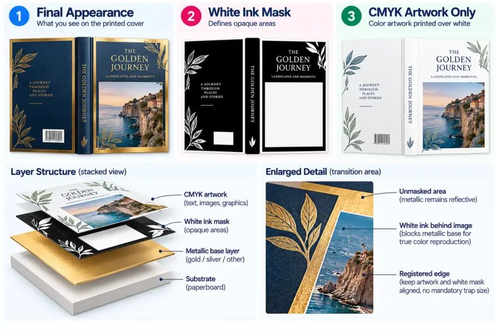
Do not let the white plate default to the whole sheet. That can conceal the very effect the stock was purchased to provide. Do not simply omit white everywhere either: skin tones, neutral backgrounds and fine reversed text then need approval on the exposed metallic base.
White opacity is a production variable, not a checkbox in the design file. Ask prepress how the chosen system produces the required coverage, what separation name to use, and how edges will be handled. Supply clearly named layers or files using the printer’s instructions; do not impose a universal trapping value.
Use the hardcover cover-file setup guide for case-wrap geometry, joints and turn-ins. Add the metallic-effect map to the approved template; do not create a second cover size from the artwork preview.
A wrapped case adds problems that a flat sample cannot answer
A metallic sheet needs to survive the required assembly. For a printed paper case, inspect wrapped corners, turn-ins and the moving joint. For a dust jacket, inspect folds, flaps and rubbing during removal. For a slipcase, inspect the wrap at board edges and where the book contacts the enclosure.
Specify a covering-grade candidate for the actual component. A rigid metallic board sold for packaging is not automatically a flexible case wrap. Confirm the complete construction, including stock, ink, coating, adhesive and wrapping method, before accepting a substitution.
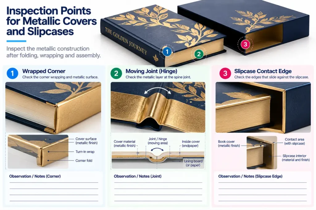
For a book jacket and slipcase set, one gold reference is a design target, not permission to use one untested finish on every component. Compare the components together if visual coordination matters. Their surface texture, angle and finishing can differ.
PrintPack360’s hardcover finishing guide also covers UV, embossing and edge treatments alongside foil. Check those options when coordinating the rest of the edition.
Replace “match this gold” with an approval packet
Request an approval packet containing the component name, material reference, artwork revision, metallic process, finishing order and physical reference. For foil, include manufacturer, grade and shade. For metallic ink, include the actual ink and overprint construction. For metallic paper, include the stock and white-mask revision.
Approve the finished surface under agreed lighting and at more than one viewing angle. Then inspect its assembled form and agreed handling behavior. A normal paper proof can approve content and placement; it cannot reproduce a reflective surface merely by printing a yellow or gray patch. PrintPack360’s sample strategy helps separate those approval scopes.
Compare quotes only after the constructions are named. Ask suppliers to itemize the relevant die or setup, printing, white ink, finishing, sampling and assembly. Do not assume foil is always the expensive option: coverage, sheet layout, quantity and additional operations decide the actual quotation. No universal crossover quantity is defensible without the job details.
For a custom hardcover book project, send the cover artwork with the metallic regions marked, the intended component and a description of the required reflection. These details allow process selection to begin; a screen rendering labeled “premium gold” leaves them unspecified.
PrintPack360 hardcover-book orders start at 50 copies. Include the selected metallic process in the quotation request so tooling, materials and sampling are priced for that specification.
FAQ
Can the same metallic treatment be used on the case, jacket and slipcase?
Yes, when the selected material and process work on each component. Specify and approve them separately, then compare the assembled set.
Is a separate foil layer the same thing as a fifth printing ink?
No. A named spot separation can instruct a stamping operation without becoming an ink printed on press. Identify its function in both the file and quote. An actual metallic spot ink is a printing material; a foil separation describes the transfer area.
Can metallic ink give the same appearance as hot foil?
Do not purchase it as an automatic visual substitute. Compare the nominated ink and foil after the actual finishing sequence, and approve the required reflection and texture. Product-specific effects exist; the process names alone do not establish equivalence. Related public discussion: metallic inks versus hot foil.
Are metallic ink and cold foil interchangeable terms?
No. Metallic ink contains reflective pigment; cold foil is a transfer process. If a supplier uses “metallic” as a catch-all, require the process name in the quote before approval. This article compares hot foil, ink and reflective stock; a proposed cold-foil or digital-transfer alternative needs its own production description. Related public discussion: why metallic ink is not foil.