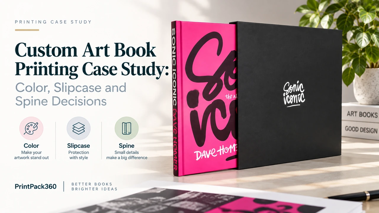
The first physical sample looked good. It also gave us two reasons not to approve mass production.
Fine scratches were visible on the matte-laminated cover under directional light. The oversized spine lettering, while visually strong, occupied almost all of the usable 15.3 mm spine. Neither issue ruined the sample. Both could become expensive if repeated across 150 finished sets.
That is where this project became useful as a custom art book printing case study. The challenge was not simply to print a large pink book and place it in a black slipcase. It was to decide which details had to match the original concept, which materials had to change, and which risks the client was willing to accept after seeing physical evidence.
The client was an Australian creative professional producing a square, image-led hardcover. Their name and the title are withheld here, but the production details and decisions are real. The project ran from the first specification in March 2026 to completion of the 150-set production run in September 2026.
Project Specification at a Glance
| Component | Approved production specification |
|---|---|
| Finished size | 310 × 310 mm square hardcover |
| Extent | 120 interior pages plus 8 pages of bright pink endpaper, 4 at the front and 4 at the back |
| Interior | Full-color printing on 150 gsm matte coated art paper |
| Case | Printed art paper wrapped over 3.5 mm greyboard |
| Case protection | Scratch-resistant matte lamination |
| Slipcase | Heavy greyboard with printed paper wrap |
| Slipcase finishes | Scratch-resistant matte lamination and spot UV |
| Extraction detail | Bright pink pull ribbon selected from a physical swatch |
| Quantity | 150 complete book-and-slipcase sets |
| Destination | Australia, with sea freight planned after production approval |
The finished structure sits between a conventional coffee-table book and a collector object. Buyers considering a comparable format can review PrintPack360’s custom hardcover art book printing specifications and custom book slipcase options before preparing a brief.
The Original Brief Was Clear, but Not Yet Production-Ready
The first inquiry already contained more information than most quotation requests: final size, page count, paper weight, board thickness, endpaper color, slipcase concept and three possible quantities. Quality was explicitly more important than finding the lowest price.
One part of the brief still contained a hidden conflict. The visual system depended on black, white and an intense pink. The client also wanted to explore a black cloth-covered slipcase because cloth suited the intended premium character.
Those two requirements did not automatically belong together.
White artwork could be foil stamped onto a compatible black cloth. The available pink foils, however, did not provide a convincing match for the bright pink artwork. Printing both colors directly onto that cloth would also change the sharpness, opacity and surface character of the design. Calling the result “close enough” would have preserved the material request but weakened the visual identity.
The relevant question was therefore not “Is cloth more premium?” It was “Which surface can carry this artwork without asking one process to do something it cannot reproduce reliably?”
Our recommendation was a printed paper wrap over heavy greyboard, protected with matte lamination and finished with spot UV. That construction retained the rigid, substantial slipcase while allowing the black, white and pink design to be printed as artwork rather than approximated through unsuitable foil colors. The client accepted the change.
This is the same decision framework explained in our guide to book cloth versus printed paper cases: material prestige is not independent of artwork compatibility.
Decision 1: Treat Bright Pink as a Color Problem, Not a Color Name
The initial brief described the design as black plus fluorescent pink. The final production specification, however, recorded full-color printing. That distinction matters.
An RGB screen, a CMYK build, a Pantone spot ink and a fluorescent ink are four different color instructions. They may all be described informally as “bright pink,” but they do not produce the same optical result. Pantone’s guide to RGB and CMYK color spaces explains that these spaces are device-dependent and that substrate, ink behavior and press conditions affect the result. Pantone’s technical FAQ also states that the fluorescent appearance of a neon color cannot be reproduced through ordinary CMYK alone.
For this project, we do not retrospectively claim that the finished book used fluorescent spot ink. The responsible record is narrower: the client wanted a vivid pink-led appearance; the final files and full-color production route were approved; a physical ribbon swatch was used for the accessory; and printed samples were reviewed before the run.
For another edition, the correct route might be a named spot ink, a fluorescent ink, CMYK simulation or extended-gamut printing. The quote and proof should state which one. A reference image on a phone should never be the only color standard.
Decision 2: Let the First Sample Find Problems
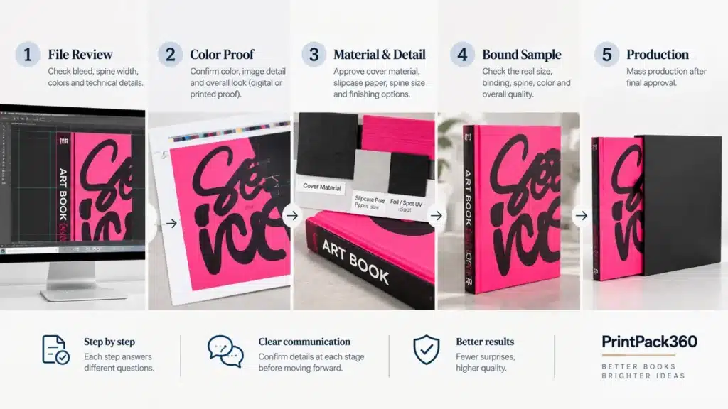
The client requested one complete sample before committing to the full order. The sample was produced, photographed, filmed and then air-shipped to Australia. After receiving it, the client confirmed that the overall result looked good and used it to refine the final artwork.
The sample did not function as a miniature ceremony before an inevitable order. It changed the production specification.
The matte surface marked more easily than expected
Under light, the first sample showed slight scratches on the matte-laminated cover. A black or other dark matte surface can make rubbing, handling marks and gloss variation more visible than a lighter or busier design.
We flagged the issue before shipment and proposed scratch-resistant matte lamination for the production run. The upgrade was then written into the final book and slipcase specifications.
“Scratch-resistant” should not be interpreted as scratch-proof. Its job is to improve the surface’s tolerance of normal manufacturing and handling. A representative finished sample and sensible packing are still required, particularly when one dark surface slides against another.
The sample could not economically represent every final detail
The slipcase confirmation sample temporarily used a black pull ribbon because the selected pink ribbon had not yet arrived. It also did not include the final spot UV application. Those substitutions were disclosed before approval; the bulk specification still required the selected bright pink ribbon and spot UV.
That distinction is easy to miss. A sample can approve the features it physically represents and can support a decision about declared substitutions. It cannot silently approve an absent finish.
PrintPack360’s sample strategy separates material swatches, structural samples, printed proofs and approved production references because each answers a different question. ISO 12647-7 makes a similar distinction at the color-proofing level: a hard-copy proof intended to simulate a defined printing condition is a controlled proofing system, not simply any color printout.
Decision 3: Do Not Guess the Spine or Slipcase from Nominal Paper Weight
When the first files arrived, the client was unsure about both spine width and slipcase dimensions. That was reasonable. A calculation based only on “120 pages at 150 gsm” would not have been enough.
Paper grammage describes mass per unit area, not exact sheet thickness. Book bulk also depends on the specific mill sheet, coating, moisture, folding, sewing, adhesive, compression and casing-in. The slipcase then has to fit the finished case, not the nominal text block.
The production sequence was therefore:
- Confirm the interior paper, pagination and binding route.
- Calculate the working cover layout and produce the book sample.
- Check the finished book thickness and external case dimensions.
- Build the slipcase around the representative finished book.
- Test removal, insertion and pull-ribbon position before bulk approval.
The book spine settled at approximately 15.3 mm. For buyers preparing similar packaging, our guide to measuring a book for a slipcase explains why the finished object, clearance and sample condition matter more than adding a generic allowance to three dimensions.
Decision 4: Make Spine Risk Visible Before Asking for Approval

The final design used large spine lettering on both the book and the slipcase. On screen it created a strong vertical statement. In physical production it left very little tolerance for movement.
Case making is not the same as trimming a flat printed sheet. Printed covering material is positioned and wrapped around board; the case is formed; the book block is cased in; joints and grooves influence the visible area. When lettering nearly fills the spine width, a small normal movement becomes visually obvious even if the book remains structurally sound.
Our designer reduced the lettering and moved nearby cover artwork away from the groove to create a safer version. The client reviewed the adjustment but preferred the impact of the original larger type. Their instruction was explicit: keep the large version, even if minor placement imperfections remained possible.
Production then followed that approved choice.
This is an important division of responsibility. A printer should identify foreseeable manufacturing risk, show a safer option and record the decision. The printer should not quietly redesign the work, but “the client supplied the file” is not an adequate reason to ignore an obvious problem.
The same review also corrected the reading direction of the slipcase spine and confirmed that the logo would appear on both faces. These are modest details on a proof and conspicuous errors on a finished set.
Decision 5: Preflight Content Without Becoming the Author
During file review, our designer noticed unusual question marks and punctuation on several interior pages. They could have been intentional graphic elements or content errors. Rather than delete them or let them pass without comment, we marked the affected pages and asked the client to confirm.
The client confirmed that the marks were intentional.
That exchange defines useful preflight. A production team should flag anomalies, missing bleed, low-resolution images, incorrect finish layers and text entering unsafe areas. It should not rewrite creative content without authorization. A strange mark is not necessarily a typo; a silent assumption can damage the work in either direction.
Final print PDFs were then supplied for approval. Spot UV areas were shown in a contrasting proof color solely to identify their position; the finished UV itself would be transparent. The Ghent Workgroup’s PDF/X workflow guidance is useful background for reliable file exchange, but a compliant PDF still needs project-specific checks for the cover wrap, spine, endpapers, slipcase dieline and finish separations.
The Approval Map Used on This Project

The project did not depend on one all-purpose “approved” email. Different evidence closed different risks.
| Decision | Evidence used | What it approved | What it did not approve |
|---|---|---|---|
| Page content and sequence | Digital PDF and page preview | Pagination, visible content and identified punctuation | Paper feel, final press color and binding |
| Book size and construction | Physical book sample | Overall scale, materials, case construction and handling | Undeclared bulk changes |
| Matte-surface durability | Inspection of the first sample | Need to improve scuff resistance | A promise that no mark could ever occur |
| Slipcase material | Artwork/process review plus sample | Printed paper wrap as the workable route for white and pink graphics | Cloth reproduction of the same artwork |
| Spine typography | Adjusted file and physical confirmation | Client’s chosen large-type version with disclosed placement risk | Zero production tolerance |
| Ribbon color | Photographed physical swatch, reference 175 “Shocking Pink” | Accessory color selection | Printed pink color on paper |
| Spot UV | Separate marked location proof | Position and artwork extent | Appearance of a finish absent from the temporary sample |
| Slipcase fit | Finished-book measurement and constructed sample | Insertion, removal and working clearance | Fit after an unapproved material or thickness change |
The practical rule is simple: write the noun after “approved.” Approved content. Approved ribbon. Approved structure. Approved UV position. The word by itself is too broad.
What Changed Between the First Brief and the Production Run?
| Original request or assumption | Production concern | Final decision |
|---|---|---|
| Black cloth slipcase with white and bright pink graphics | White foil was feasible, but available pink foil could not reproduce the intended bright pink convincingly | Printed paper-wrapped rigid slipcase with full-color graphics |
| Standard matte lamination | Slight scratches were visible on the first sample | Scratch-resistant matte lamination on book and slipcase |
| Large spine text as supplied | Minimal safety margin on an approximately 15.3 mm spine | Safer version offered; client knowingly retained the larger type |
| Slipcase dimensions estimated from files | Actual cased-book thickness could differ from a nominal calculation | Slipcase sized and tested from the finished book |
| Bright pink ribbon requested by description | Screen color and verbal descriptions were insufficient | Physical swatch selected: 175 “Shocking Pink” |
| Complete visual sample expected | Temporary sample lacked final pink ribbon and spot UV | Substitutions disclosed; final components approved separately |
The point is not that specifications should change during every order. It is that changes should occur before bulk production, for an identified reason, with an updated record.
The Result: 150 Sets Completed, Without Rewriting the Design
Once the final PDF, spine treatment, printed-paper slipcase, ribbon reference and finish locations were approved, the order moved into production. The run comprised 150 hardcover books and fitted slipcases.
After production, photographs and videos were sent to the client. The client confirmed that the finished sets looked good and thanked the team for the service. At the time this case study was prepared, the order had been packed and scheduled for sea shipment to Australia. We therefore describe the project as production completed and shipment arranged, not as delivered.
The book still looked like the client’s book. The production team had not muted the pink, automatically reduced the bold spine or forced the design onto cloth for the sake of the first specification. The work was to preserve the visual priorities while making the physical object manufacturable and making the remaining risk explicit.
Five Instructions to Put in an Art Book Brief
For a large-format custom art book printing project, send more than trim size, page count and quantity. Include these five instructions:
- Define critical color by process and reference. State whether a color is CMYK, a named spot ink, fluorescent ink or an approved printed target.
- Rank the non-negotiables. If exact artwork color matters more than a particular cover material, say so before materials are sourced.
- Name what the sample must answer. Color, surface resistance, binding, spine position and slipcase fit may require different evidence.
- Freeze the book before freezing its enclosure. Finalize paper, pagination, binding and external case materials before approving the slipcase dimensions.
- Record accepted risk. If a bold design uses less safety margin than recommended, approve the exact version and the disclosed consequence in writing.
The hardcover book printing specification page provides a useful starting list for size, paper, cover material, binding and finishes. For an image-led project, add reference images, critical color information, delivery destination and the decisions you expect the physical proof to settle.
FAQ
Will a physical art book sample look exactly like the production run?
It should represent the agreed materials and processes as closely as the sample scope allows, but the manufacturer must disclose substitutions. A one-off sample may use a different printing route, omit an uneconomical finish or use a temporary accessory. Approve the represented attributes individually and record what remains to be confirmed in production.
Can the slipcase dieline be finalized before the hardcover is made?
A provisional dieline can be prepared, but final fit should be checked against a production-representative finished book. Paper bulk, sewing, adhesive, board, covering material and casing pressure all affect the external dimensions. Include any jacket, belly band or wrap when testing fit.
Is anti-scratch matte lamination scratch-proof?
No. It improves resistance to visible scuffing compared with many standard matte surfaces, but abrasive contact, dirty handling surfaces and movement inside packing can still leave marks. Test the actual dark color and finish, then design the packing to prevent face-to-face rubbing.
What should be approved before printing a hardcover art book with a slipcase?
Approve final content, paper, color target, book construction, cover wrap, spine, endpapers, finish separations, ribbon or accessories, slipcase structure and fit, packing method and any declared sample substitutions. Each approval should identify the file or sample revision.
Can CMYK print a true fluorescent or neon pink?
Ordinary CMYK can simulate a bright pink but cannot reproduce the fluorescent effect of a neon ink. If fluorescence is essential, specify an appropriate spot or fluorescent ink and test it on the intended paper and finish. Do not approve it from an RGB screen alone.
Can a printed paper slipcase still feel premium compared with cloth?
Yes. Premium character can come from board weight, fit, edge quality, print, lamination, spot UV and the relationship between book and enclosure. Cloth is valuable when its texture serves the design; it is not automatically superior when the artwork depends on detailed multicolor reproduction.
Is spot UV necessary on a matte black slipcase?
No. It is useful when selective gloss contrast supports the design, but it adds a separate artwork layer, setup, registration requirement and approval point. A restrained matte slipcase may be stronger without it. Decide by visual function, not by the number of premium finishes listed in the specification.
How large can hardcover spine text be?
There is no universal maximum. The safe size depends on finished spine width, case wrap, joints, board construction, lettering shape and acceptable production movement. Ask the printer to mark the usable spine area on the final template. Type that nearly fills it can be produced, but minor movement will be much more visible.