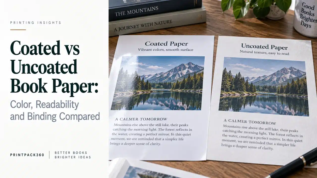
The color proof has been approved. The photographs are balanced, the shadows are open and the skin tones look right. Then someone changes the interior from coated paper to uncoated paper because the book should feel “more natural.” The files remain unchanged, but the printed result does not.
That is not a press failure. Paper is part of the color system.
The usual summary of coated vs uncoated book paper is that coated stock is for pictures and uncoated stock is for text. It is a useful first sentence and a poor final decision. Smooth uncoated papers can produce refined art books. Matte-coated papers can still reflect light. A heavily coated, high-GSM sheet can make a sewn book stiff and unnecessarily heavy. An absorbent uncoated grade can give illustrations exactly the quiet, tactile character the designer wanted.
The correct choice depends on content, print condition, reader, binding and commercial use.
Coating Is a Surface Treatment, Not a Quality Ranking
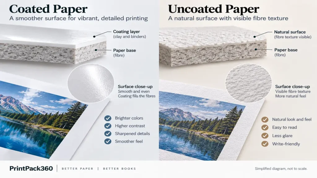
Coated papers receive a surface layer, commonly containing mineral pigments and binders, that fills irregularities in the fibre structure. The resulting surface can be smoother and more controlled for printing. Common book finishes include gloss, silk, satin and matte, although names vary between mills and markets.
Uncoated papers do not have that mineral coating. Their fibre structure remains more apparent, from very smooth premium grades to visibly textured or bulky book papers. “Uncoated” therefore covers a wide range of shades, roughness, opacity and print behavior.
Neither category is a single product. When requesting a quotation, name the proposed grade or require approval of an equivalent. “157 gsm matte” and “100 gsm uncoated” are incomplete specifications without shade, bulk, opacity, surface, press compatibility and sample expectations. The broader book printing paper guide explains how those properties work together.
The Practical Differences at a Glance
| Decision factor | Coated paper | Uncoated paper | What the buyer should verify |
|---|---|---|---|
| Image detail | Usually supports sharper dots and controlled fine detail | Can appear softer; premium smooth grades can still reproduce sophisticated images | Print representative shadow, skin-tone, neutral and fine-detail pages |
| Color appearance | Often higher apparent saturation and contrast | Often quieter or more muted because of surface and ink interaction | Use the correct output condition and a physical proof |
| Glare | Gloss can be highly reflective; silk and matte reduce but do not eliminate reflection | Generally low glare | View spreads under realistic reading and gallery lighting |
| Tactile character | Smooth, polished or refined depending on finish | Natural, warm, porous or textured depending on grade | Handle folded sections, not only small swatches |
| Writing | Usually unsuitable unless specifically designed for writing | Often more suitable for pencil and pen | Test the actual writing tool, drying and show-through |
| Folding and binding | Heavier coated stocks may resist folding and opening; grain is critical | Bulky stocks can enlarge the spine; rough sheets may need process adjustment | Confirm grain, signature plan, caliper and bound sample |
| Weight | A high-GSM coated book can become heavy quickly | High-bulk uncoated paper can create thickness without the same mass | Calculate both finished block thickness and shipment weight |
| Surface damage | Gloss may show scratches; matte-coated surfaces can scuff or polish | May mark, absorb soil or abrade depending on grade | Run rub, scuff and handling checks relevant to use |
Why the Same Artwork Prints Differently
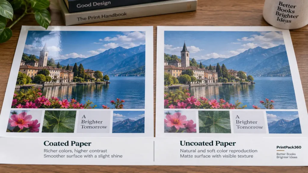
Ink sits and spreads differently on different surfaces. A smoother coated sheet generally keeps the printed dot more controlled near the surface. On an uncoated sheet, ink vehicle and pigment interaction with the fibres can reduce apparent sharpness and saturation. This does not make one result correct and the other defective; they are different print conditions.
Fogra maintains separate characterization data for sheet-fed offset on coated and uncoated substrates. Its current characterization-data table identifies FOGRA51 with PSO Coated v3 and FOGRA52 with PSO Uncoated v3. The ICC Profile Registry likewise lists profiles against defined printing conditions and warns users to ensure a profile is suitable for the intended application.
For a publisher, the operational lesson is straightforward:
- do not convert files with an arbitrary CMYK profile found online;
- tell the prepress team the final paper and printing process;
- soft-proof against the agreed output condition on a calibrated monitor;
- use a physical proof appropriate to the risk;
- do not approve coated-paper color and then expect an uncoated production run to match without adjustment.
The ISO/TC 130 guidelines for using print production standards identify substrate color and gloss among the parameters that define a printing condition. A profile name is not a quality badge; it is part of communicating the condition the file and proof are intended to simulate.
Coated Paper: Where It Earns Its Place
Coated paper is a strong starting point when image reproduction carries the book’s value. This includes photography monographs, exhibition catalogs, portfolios, cookbooks, illustrated product books and many picture books.
Gloss coated
Gloss-coated paper can produce strong apparent contrast, dense-looking blacks and vivid imagery. It also reflects directional light and can make long reading passages uncomfortable. Fingerprints, scratches and surface variation may be more visible. A dramatic image book used briefly on a table has different requirements from a museum catalog read under spotlights.
Silk, satin and dull coated
These surfaces sit between high gloss and matte in perceived sheen. They are widely used because they balance image response with more restrained reflection. The names are not standardized promises; compare actual mill swatches and printed sheets.
Matte coated
Matte-coated paper is still coated. It can preserve fine image detail while giving a quieter surface, but some matte grades scuff, rub or develop polished areas under handling. Dense dark pages deserve a rub test and realistic packing review.
For a casebound photography or exhibition project, PrintPack360’s art book printing route can coordinate paper, color proofing, sewn sections and case construction. A specific example is the casebound hardcover art book, where interior paper should be selected together with format, page count and binding rather than treated as an isolated upgrade.
Uncoated Paper: More Than a Novel Stock
Uncoated paper is the established choice for text-led books because it is low glare and can offer a comfortable, tactile reading surface. Cream and natural shades are common in fiction, memoir, poetry and literary editions. Bulky book grades can give a substantial spine without the weight of a dense coated sheet.
It is also an intentional visual medium for illustration and photography. A smooth premium uncoated stock can soften contrast, reduce the commercial gloss of an image and allow paper texture to become part of the work. That can suit archival projects, artist books, restrained fashion lookbooks and museum publications. The result should be designed for the surface rather than judged against a glossy reference.
Arctic Paper’s guide to selecting uncoated paper treats surface, shade, opacity and bulk as separate variables. This distinction matters because a rough, high-bulk cream novel paper and a smooth bright-white premium uncoated sheet should not be expected to reproduce the same image.
The novel printing route is most relevant when extended reading, book-block thickness and cost control dominate. An illustrated novel may still justify a smooth white uncoated grade or selected coated signatures; content, not category labels, should lead.
Matte Coated Is Not the Same as Uncoated
This confusion causes avoidable quotation and proofing problems.
Both can appear non-glossy, but matte-coated paper has a coating layer and generally a smoother, more closed surface. Uncoated paper exposes more of the fibre structure and often absorbs ink differently. They can differ in color gamut, dot behavior, tactile feel, folding, glue interaction, scuffing and writing performance.
When a buyer says “matte paper,” the supplier should ask which of these is intended:
- matte-coated art paper;
- smooth uncoated white paper;
- natural or cream uncoated book paper;
- textured specialty paper;
- a laminated or varnished cover surface rather than interior paper.
A phone photograph cannot reliably settle the choice. Ask for labeled swatches and a two-sided printed test.
Paper, Page Count and Binding Form One Decision
A 96-page art catalog on 170 gsm coated stock and a 320-page catalog on the same sheet are different structures. More pages increase block weight and stiffness. Heavy coated sections may resist opening, place more load on endpapers and joints, and make a large-format hardcover uncomfortable to hold.
Uncoated paper creates different problems. A high-bulk grade can produce an unexpectedly wide spine. A rough surface may need different ink and press control. Paper grain running the wrong way can reduce fold quality and opening behavior in either category.
Before selecting paper, ask the printer to confirm:
- page count and imposed signature plan;
- paper grain direction after imposition;
- caliper and expected book-block thickness;
- sewing, PUR or other binding method;
- fold and cracking risk for the proposed GSM;
- case, jacket and slipcase dimensions;
- estimated finished weight and packing plan.
The hardcover book printing cost guide explains how paper consumption, binding, proofing and freight combine in the delivered cost. The offset vs digital book printing guide adds another constraint: the selected paper must be qualified for the actual press, not just available from a merchant.
When a Mixed-Paper Book Is the Better Answer
A book does not always need one interior stock. A text-led history book might use uncoated paper for the main block and group color photographs into one or more coated sections. A brand book might use coated image signatures with uncoated interview pages. Endpapers may use a separate uncoated, colored or specialty stock.
Mixed stocks can solve a real editorial problem, but they add manufacturing work:
- page groups must align with the signature and collation plan;
- different papers may fold and compress differently;
- bound edges can reveal changes in shade and thickness;
- section placement affects sewing and opening;
- short color inserts can create disproportionate setup and handling cost;
- proofing must identify which pages are approved on which substrate.
Ask the printer to propose the section map before the designer freezes pagination. Scattering isolated coated leaves through a text block is not equivalent to planning complete coated signatures.
A Decision Table for Publishers
| Project priority | Strong starting point | Why | What could change the answer |
|---|---|---|---|
| Long-form black text | Uncoated book paper | Low glare, natural hand, useful bulk and broad shade choice | Illustrations, extreme page count, writing use or digital-press limits |
| Color-critical photography | Coated, usually matte/silk/gloss according to viewing intent | Controlled detail, contrast and ink holdout | Deliberately tactile art direction, glare, book weight or short-run press route |
| Illustration with flat colors | Smooth uncoated or coated | Either can work with different visual character | Required saturation, spot colors, opacity and texture |
| Children’s picture book | Coated or qualified smooth uncoated | Color, page stiffness, handling and feel must be balanced | Age group, binding, surface protection and intended writing/activity use |
| Cookbook | Matte/silk coated or suitable uncoated | Images need clarity; text needs readability | Kitchen handling, wipeability, weight and cost |
| Museum or gallery catalog | Coated, premium uncoated or mixed stocks | Paper can support curatorial and tactile intent | Lighting, image type, edition budget and archival expectations |
| Workbook, journal or coloring book | Uncoated | Pencil/pen interaction and low glare | Marker bleed, erasing, image coverage and paper availability |
For a children’s project, begin with the children’s book printing route and state the reader age, page count and whether pages must accept writing. “Durable paper” is not enough; the complete page and binding construction needs to be evaluated.
How to Approve the Paper Without Over-Proofing
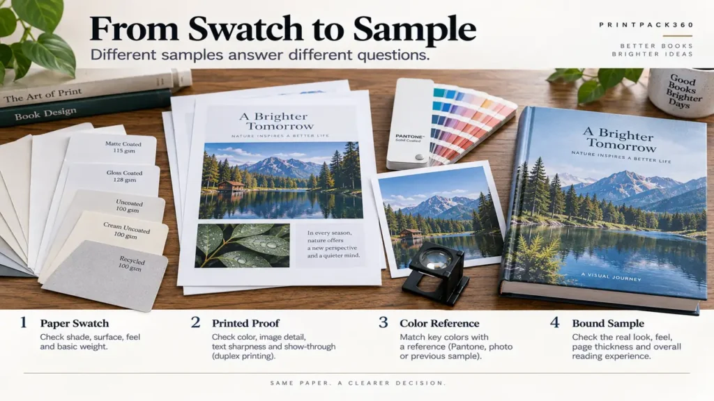
Use proofing effort where a wrong assumption would be expensive.
Stage 1: Labeled swatches
Compare shade, surface, thickness and tactile character. Record mill, grade, GSM and any certification requirement. A small swatch does not approve color or binding.
Stage 2: Representative duplex print
Choose a compact test set: darkest image, pale neutral, skin tone, saturated illustration, fine text, reversed text and a spread crossing the gutter. Print both sides to expose opacity and show-through behavior.
Stage 3: Color reference
For color-critical books, agree on the output condition and proofing method. A coated proof should not silently become the approval target for uncoated production. Record what the proof is intended to simulate.
Stage 4: Folded or bound sample
Check opening, stiffness, cracking, gutter loss, paper noise, spine thickness and finished weight. For a slipcase or jacket, use the actual proposed paper and binding wherever fit is critical.
PrintPack360’s sample strategy explains why swatches, printed proofs, dummies and finished samples approve different risks. Keep one signed reference and its specification with the production record.
What to Put in the RFQ
Send more than “matte art paper” or “premium uncoated.” Include:
- book type and intended audience;
- trim size, final page count and quantity;
- black, CMYK and spot-color requirements;
- proportion of photography, illustration and text;
- proposed paper grade, GSM, shade and surface, or the performance you need;
- binding and opening expectation;
- mixed-stock or insert plan;
- proofing requirement;
- certification or approved claim requirement;
- delivery destination and acceptable finished weight.
Ask the supplier to identify any paper substitution in writing and to state whether re-proofing is required. For repeat editions, retain the named paper, production condition and approved sample rather than specifying only GSM.
Coated paper is not inherently more professional, and uncoated paper is not a compromise. The better stock is the one that gives the content the intended voice, remains manufacturable at the chosen page count and produces a book the reader can comfortably use.
FAQ
Is matte-coated paper the same as uncoated paper?
No. Matte-coated paper has a coating layer with a low-sheen surface; uncoated paper retains a more exposed fibre surface. They differ in ink interaction, image response, texture, folding and writing performance. Require labeled swatches instead of relying on “matte.”
Can an art book be printed on uncoated paper?
Yes. Smooth premium uncoated paper can produce sophisticated images with a softer, tactile character. It should be chosen intentionally, with files prepared for the agreed print condition and representative images physically proofed.
Can one book combine coated and uncoated pages?
Yes, especially when a text-led book contains grouped color plates. Plan the stocks as complete signatures or clearly controlled inserts whenever possible. Confirm collation, folding, sewing, edge appearance, spine thickness and proofing before pagination is frozen.
Does coated paper make a book more expensive?
Often, but not universally. Grade, GSM, sheet yield, quantity, press, binding, waste and freight determine the difference. A heavier coated stock may add cost through both material and shipping; compare complete delivered specifications rather than paper price alone.
Why does the same brand color look different on coated and uncoated paper?
The substrate’s shade, gloss and ink interaction change perceived color. A Pantone name or identical CMYK values do not guarantee identical appearance across surfaces. Establish separate approved references when components must look visually consistent. Related public discussion: designers discussing coated and uncoated brand-color references.
Will a Pantone red automatically look richer than CMYK on uncoated paper?
Not automatically. A spot ink may reach a target that four-color process cannot, but the uncoated substrate still affects its appearance. Compare an ink drawdown or press-relevant proof on the actual paper and define the acceptable target. Related public discussion: a 2026 question about CMYK versus Pantone red on uncoated stock.
Do photo books always need coated paper?
No. Coated paper is a strong choice for crisp detail and apparent contrast; premium uncoated stock can support a quieter photographic language. The right answer depends on the images, edition size, printing process, binding and intended feel. Related public discussion: a photographer’s 2026 account of comparing small-run photo-book processes and papers.
Why can “premium color” still look flat on uncoated paper?
The service label may describe the press or quality tier rather than a coated substrate. Paper surface, ink system, profile and image preparation still control the result. Ask for the exact stock and order a representative proof before committing to a full image-led book. Related public discussion: self-publishers comparing premium color options and coated-paper expectations.