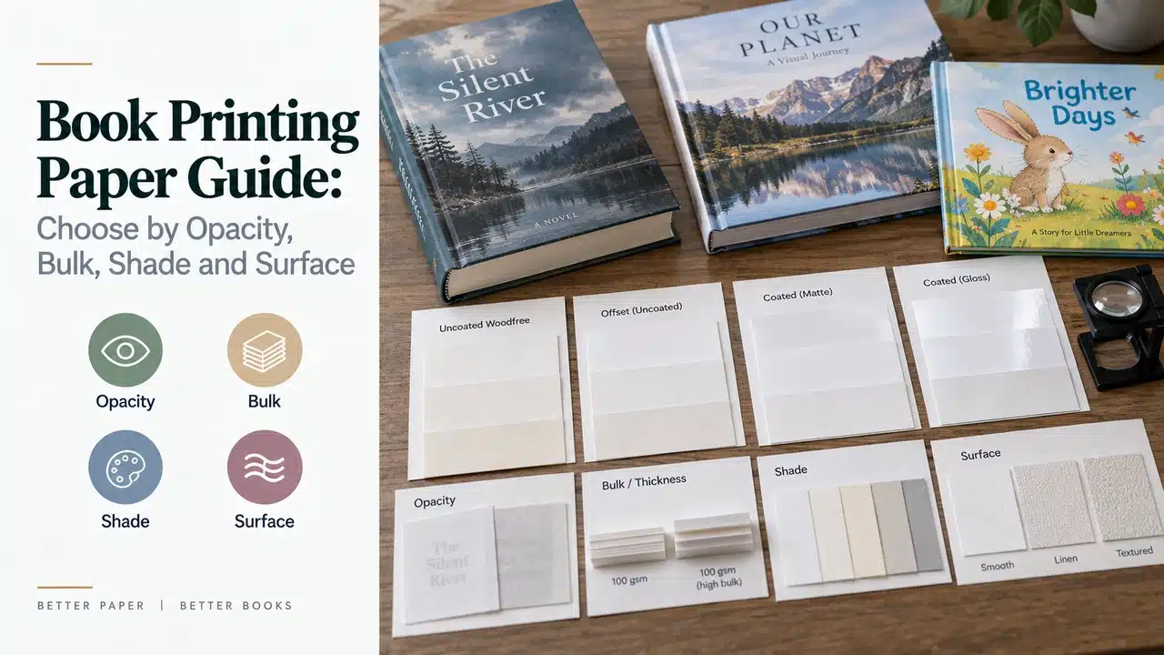
Put two sheets marked “80 gsm” on a table and they may not feel like the same material. One is compact, bright and smooth. The other is cream, slightly toothy and noticeably thicker. Printed on both sides, one may hide the next page better. Folded into 250 sheets, one may create a book block a full centimeter thicker than the other.
That is the first rule of book printing paper: grammage is a useful measurement, but it is not a complete paper specification.
Publishers often begin with “80 gsm for a novel” or “157 gsm art paper for a photo book.” A manufacturer still needs to know what the book must do. Long-form text needs comfortable reading and controlled show-through. Reproductions of paintings need predictable color and detail. A children’s picture book needs page stiffness, clean handling and a construction suited to its age group. A workbook may need pencil or marker compatibility. All of them must fold, bind, open and ship.
This guide provides a decision method rather than a universal paper chart.
The Six Properties That Belong on a Paper Decision
| Property | What it tells the buyer | What it does not tell the buyer |
|---|---|---|
| Grammage (GSM) | Mass per square metre | Exact thickness, stiffness, opacity or print result |
| Thickness / caliper | Physical thickness of one sheet under a stated method | How much a sewn or glued book block will compress or swell |
| Bulk | Volume per unit mass; how thick a grade is for its weight | Printability, durability or opacity by itself |
| Opacity | Resistance to show-through from the reverse side or next sheet | Whether heavy ink will set off, dry well or reproduce cleanly |
| Shade and brightness | The visual character of the unprinted sheet | A universal measure of reading comfort or color accuracy |
| Surface | Smoothness, texture, coating and ink holdout | Whether the paper is qualified for the proposed press and binding route |
ISO 536:2019 covers determination of grammage. ISO 534:2011 separately covers thickness, density and specific volume, while ISO 2471:2008 covers determination of opacity by diffuse reflectance. The existence of separate test methods is a useful reminder: GSM, thickness and opacity are different properties.
GSM Does Not Predict Spine Width
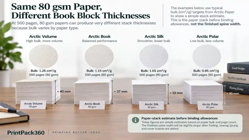
GSM answers a weight question: how many grams would one square metre of the paper weigh? It does not tell the designer how thick 300, 500 or 750 pages will become.
Bulk helps explain the difference. In practical paper data, bulk is often expressed in cubic centimetres per gram. A simplified conversion is:
Approximate sheet thickness in micrometres = grammage × bulk
This is useful for early planning, but it is not a final spine-width formula. Folding, sewing thread, signature count, adhesive, compression, moisture and production variation all affect the finished block. The cover file should use the printer’s confirmed spine measurement after the paper and binding route are fixed.
A published-data example
Arctic Paper publishes several versions of one cream book-paper family at the same 80 gsm grammage. Its technical data lists 120 μm thickness at 1.5 bulk, 144 μm at 1.8 bulk and 160 μm at 2.0 bulk. The manufacturer labels the figures as target values subject to change; they are examples, not PrintPack360 specifications. See the Munken Print Cream technical table.
For a 500-page book, before binding allowances:
| Published paper example | Sheets in 500 pages | Nominal sheet thickness | Simple paper-stack estimate |
|---|---|---|---|
| 80 gsm, bulk 1.5 | 250 | 120 μm | 30 mm |
| 80 gsm, bulk 1.8 | 250 | 144 μm | 36 mm |
| 80 gsm, bulk 2.0 | 250 | 160 μm | 40 mm |
The same 80 gsm label produces a 10 mm difference in the simple stack calculation. That difference can change the spine artwork, case board dimensions, carton count, freight weight-to-volume balance and the fit of a slipcase. This is why the hardcover book structure and paper choice need to be settled before final cover dimensions are released.
Opacity Is the Property Readers Notice Without Naming
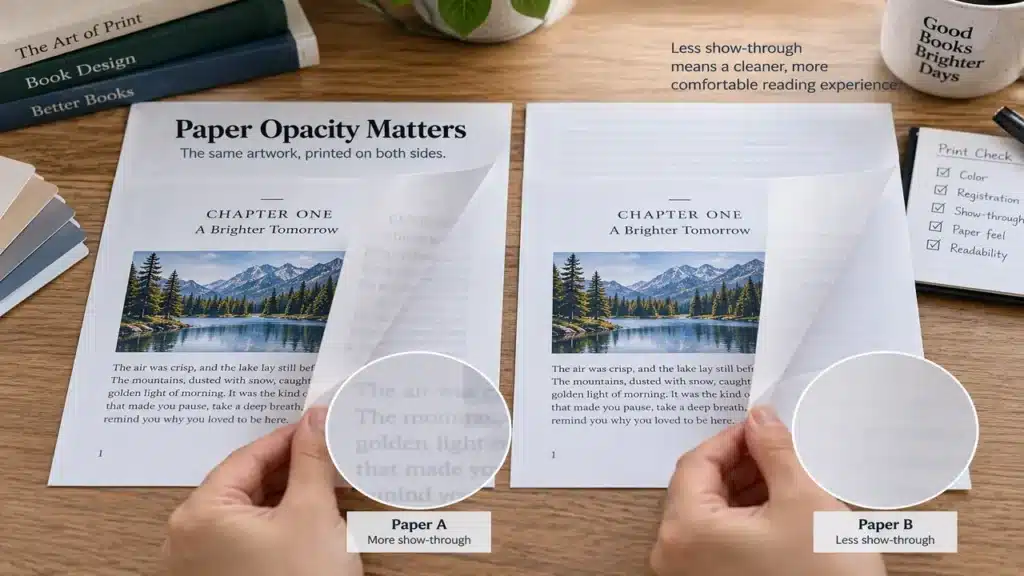
When text or images from the reverse side interfere with the current page, buyers often describe the paper as “too thin.” Thickness may be part of the problem, but opacity is the closer specification. Fillers, fibre composition, shade, formation, coating and grammage can all influence show-through.
UPM’s published sheet for one lightweight book grade shows why weight alone is not enough: within the same UPM Book 68 Bulk 1.65 family, the target opacity rises from 91.5% at 45 gsm to 94.0% at 52 gsm. The data sheet also says values are informative and subject to production variation. See the UPM Book technical data.
Do not turn those figures into a universal pass/fail threshold. A black-text novel, a full-coverage comic and a pale illustrated children’s book place different demands on a sheet. Instead:
- Ask for the named paper grade and its current technical data.
- Print representative high-coverage and light-coverage pages on both sides.
- View the pages in sequence, not as isolated sheets on a dark table.
- Check show-through, strike-through, set-off and loss of small reversed text separately.
- Approve the paper and print process together.
Surface Controls More Than “Glossy or Matte”
Coated paper has a mineral coating that creates a more controlled printing surface. Depending on the grade and finish, it can support sharper image detail, stronger ink holdout and higher perceived contrast. Gloss-coated paper can intensify reflections; matte or silk-coated papers reduce glare but are not all equally smooth or scuff-resistant.
Uncoated paper leaves more of the fibre surface apparent. It can feel natural and tactile, supports comfortable long-form reading and may be appropriate for writing, but images can appear softer or less saturated because of the surface and ink interaction. Premium smooth uncoated grades can reproduce sophisticated color; “uncoated” does not mean low quality.
Arctic Paper’s uncoated paper selection guide likewise treats shade, surface, opacity and bulk as separate choices. A useful supplier conversation therefore sounds like “smooth natural-white uncoated, suitable for four-color offset, with the opacity and caliper shown in the approved sample,” not simply “matte paper.”
Paper Shade Changes the Page Before Ink Arrives
Cream, natural white, high white and blue-white sheets create different visual relationships.
- Cream or natural shades can suit novels, memoirs, poetry and historically styled editions. Black text appears against a warmer field, while color images may also shift warmer.
- Neutral white is a flexible starting point for mixed text and image content.
- High-white papers can make clean backgrounds and saturated colors appear more vivid, but the result depends on the paper, ink and viewing light.
Brightness, whiteness and colorimetric shade values are not interchangeable terms. Optical brightening agents can also affect appearance under different illumination. A buyer does not need to become a paper laboratory, but should compare physical swatches under neutral viewing light and see representative printed images. “Match the PDF” is not a paper-shade specification.
For a repeat title or a multi-volume set, record the mill, grade, shade, grammage and acceptable substitution procedure. “Same cream paper” is too vague if different lots, mills or markets may be involved.
Best Starting Point by Book Type
The table below is a briefing tool, not a fixed material prescription.
| Book type | Sensible paper direction | Main risks to test | Commercial consequence |
|---|---|---|---|
| Text-led novel or memoir | Cream, natural or white uncoated book paper; weight and bulk matched to page count | Show-through, spine size, fold quality, reading feel and shipping weight | An unnecessarily heavy sheet can make a long book bulky and expensive without improving reading |
| Illustrated novel or graphic narrative | Smooth uncoated or suitable coated grade, depending on image style | Shadow detail, solids, opacity, crossover images and binding | Paper may need to balance text comfort with image reproduction |
| Photography or fine-art book | Matte, silk or gloss coated paper, or a qualified premium uncoated grade | Color target, detail, glare, cracking at folds, weight and sewn-section behavior | High GSM increases block weight, binding load and freight; a sample is essential |
| Children’s picture book | Coated or qualified uncoated paper with appropriate stiffness and surface durability | Page turning, show-through, rub/scuff, fold and age-appropriate construction | “Thicker” is not automatically safer or more durable; finished construction matters |
| Coloring or activity book | Uncoated paper selected for the intended pencil, crayon or marker | Tooth, bleed-through, erasing, show-through and drying | Test with the actual media; marker suitability cannot be assumed from GSM |
| Workbook or journal | Writable uncoated stock | Pen feathering, ink show-through, erasing, lay-flat behavior | Page count and writing performance may conflict with a thin, lightweight block |
| Catalog or sales book | Coated, uncoated or mixed stocks according to image/content ratio | Mailing weight, image reproduction, frequent updates and finish | Paper choice influences postage, handling and reorder economics |
For long-form fiction, the novel printing route should begin with page count, trim, text color and desired reading feel. Image-led projects belong in a paper-and-proof discussion with the art book printing team. For picture books, the children’s book printing specification also needs to address binding, surface protection and intended age group.
Three Paper Decisions That Commonly Go Wrong
1. Increasing GSM to solve show-through
A heavier grade may improve opacity, but it can also create a stiff, oversized book and raise freight cost. Compare a higher-opacity grade, a different bulk, revised ink coverage or a better-suited surface before changing weight alone.
2. Selecting an art-book sheet from an unprinted swatch
A swatch shows shade, texture and hand. It does not show how the paper handles dark neutral images, skin tones, fine linework or large solids. Use representative pages, an agreed color proof and, for high-risk work, a production-relevant printed sample. PrintPack360’s sample strategy separates paper swatches, printed proofs, dummies and finished samples by what each can approve.
3. Changing paper after the cover or slipcase is approved
Changing grade can alter thickness, weight, fold behavior and case fit even when the GSM looks similar. Recalculate the spine, case, jacket and enclosure; then confirm packing. A paper substitution should trigger a documented review, not a silent purchasing change.
A Real Brief: Why a “Simple” Cream Paper Choice Affects the Whole Set
One anonymized PrintPack360 inquiry involved a two-volume collector set. Each volume was approximately 750 pages at 170 × 240 mm, with cream high-opacity paper, sewn case binding, rigid boards, decorated edges and a fitted double-book slipcase.
The paper decision in that brief could not be isolated from the rest of the product. Across roughly 1,500 pages, a small caliper difference could materially change both spine widths and the combined slipcase opening. Higher grammage would also increase set weight and international freight. Lower opacity could make the long text less comfortable, while the decorated edges added another reason to test the finished block rather than approve a loose sheet.
The practical approval sequence was therefore: confirm the named paper and technical data, make a representative text print, establish the binding route, measure a bound sample, and only then freeze case and slipcase dimensions. This is the same logic used for a single custom hardcover book, but dimensional consequences accumulate in a multi-volume set.
Sustainability Claims Must Follow the Supply Chain
“Recycled,” “FSC-certified,” “woodfree” and “eco-friendly” do not describe the same thing. A sustainability claim should identify the actual paper and the applicable documentation. If an FSC label is intended on the book, confirm the certified supply chain and artwork approval before printing. FSC explains that printed items can carry its label only when they are produced and labelled within the relevant Chain of Custody requirements; see FSC’s Chain of Custody guidance.
This should enter the specification before files are approved. PrintPack360’s eco-certified hardcover children’s book is a relevant product route for discussing paper documentation, surface protection and casebound construction together. Availability and claim scope still need confirmation for each order.
The Paper Approval Pack to Request
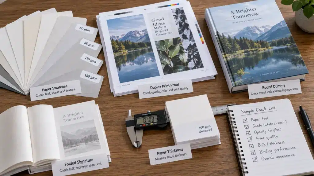
For a meaningful decision, ask the manufacturer for:
- mill and grade name or an explicitly identified equivalent;
- grammage, caliper or thickness, bulk and opacity target data;
- shade and surface description;
- printing-process compatibility;
- certification availability and claim scope, if required;
- an unprinted swatch large enough to fold and view in normal light;
- a two-sided print of representative pages;
- a bound dummy or finished sample when spine, opening or enclosure fit matters;
- written rules for paper substitution and re-approval.
For quotation, send trim size, page count, number of colors, image coverage, binding, quantity, destination and the intended reader experience. Do not ask only for “premium paper.” Premium for a 700-page literary edition may mean lightweight, opaque and high bulk; premium for a 96-page photography book may mean a very different surface and weight.
The right paper is the grade that supports the content, survives the manufacturing route and produces a book readers can comfortably use. GSM remains on the specification, but it should never be asked to make the decision alone.
FAQ
What paper should I use for a black-and-white novel?
Begin with an uncoated book paper in a white, natural or cream shade. Select the specific grade by page count, opacity, bulk, printing method and desired reading feel. A 300-page trade paperback and a 750-page sewn hardcover should not automatically use the same sheet.
Is 157 gsm coated paper always best for an art book?
No. It is a common option, not a rule. Image style, page count, format, binding, glare, fold behavior, book-block weight and freight may support a lighter coated grade or a premium uncoated paper. Compare representative printed pages and a bound sample.
What paper information should appear on a book quotation?
Ask for paper type, named grade or approved equivalent, grammage, shade, surface, and any critical caliper, bulk, opacity or certification requirement. The quotation should also state whether a substitution needs buyer approval.
Can I put an FSC label in the book if I request FSC paper?
Not automatically. The paper, production chain, claim and label artwork must meet the applicable FSC requirements. Confirm availability and approval before artwork is final; do not add an FSC mark merely because a paper sample is described as certified.
Is 80 gsm or 90 gsm better for a 500-page book?
Neither can be chosen from GSM alone. Compare caliper, bulk, opacity, shade, grain and binding performance. Published paper data can show greater thickness at 80 gsm than another denser grade at 90 gsm, so request a simple stack calculation and a bound dummy. Related public discussion: a recent 500-page bookbinding question about 80 gsm versus 90 gsm.
Why can I see text or pictures through a book page even when the paper does not feel very thin?
The issue is opacity, not touch alone. Fibre composition, fillers, shade, formation, surface and ink coverage all affect show-through. Test representative pages printed on both sides and view them in normal reading order. Related public discussion: a self-publisher comparing color-book paper after receiving a translucent proof.
Should coloring-book paper be smooth or textured?
Match the surface to the intended tool. Colored pencil and crayon benefit from some tooth; markers raise bleed-through and drying concerns. Test the actual media on both sides of the proposed sheet and decide whether reverse pages must remain usable. Related public discussion: commercial printers discussing paper for a hardcover coloring book.
Why did thicker paper make my book feel worse rather than more premium?
Thickness can increase stiffness, reduce opening comfort, enlarge the spine and make a small-format book feel like board. Review bulk, grain direction, surface and binding alongside GSM; the most substantial sheet is not always the most usable one. Related public discussion: a 2026 paper-selection discussion about stiffness and a book becoming much thicker.