Fragrance is invisible. Packaging has to make it tangible.
For a customer buying online or scanning a retail shelf, the box, label, bottle and opening experience create expectations before the product is ever smelled. That makes packaging unusually important in the home-fragrance category. It is not simply decoration around a candle or diffuser. It carries the brand story, protects fragile components, communicates safety information and helps a collection of scents look like one coherent range.
It also has to survive a demanding product environment.
Candle jars may be warm during filling. Reed diffuser oil can migrate onto a bottle or carton. Room sprays may contain alcohol. Essential-oil bottles have tight curves and very little room for mandatory or useful text. E-commerce adds vibration, impact, abrasion and temperature changes. A label that looked perfect on a flat proof can wrinkle, lift or stain after it meets the real product.
The right way to develop custom labels and printed packaging is therefore not to choose a fashionable finish first. It is to define the product, container, filling process, market, sales channel and failure risks, then build the print specification around them.
Table of Contents
Why Aromatherapy Packaging Is Becoming More Technical
Home fragrance now spans candles, reed diffusers, room and linen sprays, wax melts, incense, essential oils, electric diffusers, refill formats and gift sets. Each format creates a different interaction between formula, container, label and secondary packaging.
At the same time, brands are launching more scent variants and seasonal collections. A packaging system may need to support twelve fragrances, three vessel sizes, a discovery set and a holiday gift edition without creating twelve unrelated production problems. This is why terms such as multi-SKU label printing, short-run candle packaging, refillable fragrance packaging and custom labels on rolls have become commercially useful, not merely descriptive.
Premiumization is another part of the picture. Customers may compare a candle or diffuser with a beauty product, an interior object or a gift rather than with a household air freshener. Foil, textured paper, embossed marks, rigid boxes and controlled color can support that position, but only when the construction remains functional.
Sustainability expectations are becoming more specific too. The EU’s Packaging and Packaging Waste Regulation applies from August 12, 2026 and covers packaging regardless of material. It introduces a broader framework around packaging minimization, recyclability, reuse and information requirements. Brands selling into Europe should read the actual scope and implementation dates in the official PPWR text and 2026 guidance, rather than treating “eco-friendly” as an unrestricted marketing phrase.
The practical consequence is simple: the best fragrance packaging is not the box with the most effects. It is the system that protects the product, communicates clearly, looks deliberate and can be reproduced across every SKU.
Start With the Fragrance Format, Not the Mood Board
A packaging brief should begin with what is inside the container.
Scented candles
A candle project usually combines a glass, ceramic or metal vessel; a pressure-sensitive label or direct decoration; a caution label; and a folding carton or gift box. The packaging must protect a relatively heavy and fragile product while leaving enough room for instructions and warnings.
In the United States, the Consumer Product Safety Commission points candle businesses to ASTM candle standards, including ASTM F2058 for candle fire-safety labeling. The CPSC candle business guidance is a useful starting point, but the brand remains responsible for confirming the standards and legal requirements that apply to its product and market.
A premium front label does not replace a safety label. Treat them as two parts of one information architecture: the front carries recognition and scent identity; the base, back or carton carries safety, burning and company information in a format that remains readable.
Reed diffusers
Diffusers create a different risk. The glass bottle is usually narrow, the product may contain a chemically classified fragrance mixture, and oil can travel along reeds or around the closure. A porous uncoated paper label may darken or stain. A beautiful carton can also be damaged if a bottle is packed before its surface is clean and dry.
For EU markets, a reed diffuser or room-fragrance mixture may fall under the Classification, Labelling and Packaging Regulation depending on its actual formulation and classification. The European Chemicals Agency’s CLP guidance explains that labels for hazardous substances or mixtures can require supplier details, product identifiers, nominal quantity, hazard pictograms, signal words and hazard and precautionary statements. A hazardous consumer or professional mixture may also require a Unique Formula Identifier connected to a poison-centre notification.
That is a regulatory decision based on the finished formula, not a generic printing rule. Packaging designers should request the approved regulatory copy before locking the dieline.
Essential oils
Small essential-oil bottles are deceptively difficult. Their circumference is tight, the shoulder may begin close to the label panel and the dark glass can change the apparent color of a clear label. A few millimeters of label width can determine whether the edges overlap or lift.
The label also needs a hierarchy. Product name, botanical or scent identity, net quantity, directions, cautions, company details, lot information and market-specific content cannot all compete at the same visual level. When the required copy exceeds the practical label area, possible solutions include a carton, peel-and-reveal label, booklet label or leaflet. A fitted embossed essential oil packaging box can provide more room for product information while protecting a small glass bottle and adding tactile brand detail. The right option depends on the product classification and local rules.
Room sprays and linen mists
These products may expose the label to alcohol, water, fragrance concentrate and repeated hand contact. “Waterproof” alone is not an adequate specification. The printer needs to understand the formula, container material, filling method and expected exposure so the facestock, adhesive, ink system and protective coating can be evaluated together.
The Label Is a Material System, Not Just Printed Artwork

A pressure-sensitive label has at least four functional layers: facestock, print, adhesive and release liner. Optional white ink, varnish, lamination, foil and tactile effects add more variables. Failure in any layer can make the whole label look defective.
Paper labels: tactile and premium, but exposure-sensitive
Textured, uncoated and coated papers can make candles and essential oils feel crafted and tactile. They accept embossing and foil well and may suit a dry glass jar inside a carton.
However, paper fibers can absorb oil and moisture. Darkening around an edge is often not a print-color problem; it is product migration. If the product may be handled with oily fingers, exposed to diffuser liquid or stored in a humid bathroom, the paper and protective finish need realistic testing.
Film labels: stronger resistance and a cleaner bottle look
White, clear or metallized film labels are often chosen when moisture, oil, abrasion or transparency matters. Clear film can create a “no-label” appearance on glass, while white film provides opacity and predictable color.
Clear material introduces its own prepress requirement: normal CMYK inks are not fully opaque. White ink may be needed underneath text, logos or color areas. Without it, the bottle color and liquid can show through and make the artwork look weak.
PrintPack360’s waterproof vinyl labels with hot foil options can be specified as roll, sheet or die-cut formats, with material and adhesive selected around the actual container and use case. “Waterproof” should still be treated as a material property within a defined test, not a promise that every adhesive will bond to every bottle under every exposure.
Label material decision table
The table below is a practical starting point. Final selection should be confirmed on the actual bottle with the intended product exposure and application process.
| Label construction | Best suited to | Main advantages | Main risk to check | Practical PrintPack360 recommendation |
|---|---|---|---|---|
| Coated paper | Boxed candles, dry glass jars and value-focused essential-oil ranges | Good print quality, broad finish options and efficient cost | Edge staining, moisture and abrasion | Add a suitable varnish or lamination and test the cut edge if oil exposure is possible |
| Textured paper | Artisan candles, premium essential oils and gift-oriented collections | Tactile character; works well with restrained foil and emboss-style branding | Variable ink holdout, oil absorption and reduced fine-detail sharpness | Approve the exact paper and foil combination with a physical sample |
| White synthetic film | Diffusers, room sprays, bathroom products and frequently handled bottles | Strong opacity and better resistance to moisture and handling | Incorrect adhesive choice, edge lift on tight curves and an overly plastic appearance | Match the adhesive to the bottle surface and keep the label within the usable straight-wall panel |
| Clear film with white ink | Clear glass bottles and minimalist “no-label” designs | Lets the container remain visible while keeping selected artwork opaque | Missing white ink, visible air bubbles and label edges | Supply a separate white-ink layer and test the applied label on the filled bottle |
| Metallized or foil-accent label | Premium scent ranges, limited editions and gift sets | Real metallic impact and strong shelf differentiation | Barcode interference, foil misregistration and cracking on severe curves | Keep foil away from barcode quiet zones and approve fine details at production size |
Adhesive selection decides whether the label stays flat
Glass may look simple, but its coating, mold-release residue, surface treatment and cleanliness can affect adhesion. PET, HDPE, coated metal and painted vessels behave differently. Tight-radius bottles create greater edge-lifting force than flat panels.
Before production, record:
- Container material and supplier
- Exact label panel diameter or curvature
- Surface coating or frosting
- Filling temperature
- Whether the bottle is labeled before or after filling
- Expected oil, alcohol, moisture and heat exposure
- Application by hand or machine
- Storage and transport temperatures
ASTM maintains test methods for pressure-sensitive materials, including ASTM D3330/D3330M for peel adhesion. A laboratory number alone does not predict field performance on a specific fragrance bottle, so an applied-container trial remains essential.
Four Label Failures Fragrance Brands Can Prevent

1. Edge lifting on small or curved bottles
Typical causes include a label that is too wide for the usable panel, a stiff facestock, insufficient application pressure, contamination or an adhesive poorly matched to the surface.
The prevention is physical, not cosmetic: reduce the label width if needed, soften corner radii, confirm the adhesive and apply production samples to filled containers. Inspect them after 24 hours, one week and a temperature cycle.
2. Oil staining and ink damage
Oil can enter through an unprotected paper edge or attack a poorly selected coating. Test both the face and cut edge. For reed diffusers, include deliberate small-volume exposure near the closure because that is where leakage or handling contamination is most likely.
3. Foil cracking or misregistration
Hot foil creates a real metallic surface that digital simulations cannot reproduce. It also needs sensible artwork. Tiny reversed text, hairline borders and foil placed directly on a severe curve increase risk.
Keep the foil layer as vector artwork, establish minimum line and gap rules with the printer, and approve a physical sample on the final facestock. Foil should emphasize a logo, scent family or border, not rescue an overcrowded layout.
4. Barcodes and batch codes that cannot be used
Metallic finishes, low contrast, excessive curvature and missing quiet zones can reduce barcode reliability. Batch and date codes also need an uncoated or code-receptive area compatible with the brand’s coding method.
Scan the actual printed barcode on the applied container. Do not approve it only from the PDF.
Choosing the Right Box Structure

The box should be engineered around the product’s weight, breakability, retail channel and packing method.
Folding cartons for core retail ranges
Folding cartons are efficient for candles, essential-oil bottles and room sprays when the product needs a printed retail face but not a luxury presentation box. Straight-tuck, reverse-tuck and auto-lock structures can be adjusted for weight and filling-line needs.
For fragrance products, a carton can also carry the copy that does not fit gracefully on a small bottle. PrintPack360’s embossed essential oil packaging boxes are designed around small bottle presentation, protective fit and tactile branding, while our broader custom paper box printing options include folding cartons, sleeves, drawer styles and insert-based structures. The final board grade and bottom construction should be selected from the filled-product weight, not from an image alone.
Rigid boxes for gift sets and premium launches
Rigid boxes are useful when the packaging is meant to be kept, gifted or displayed. They can combine wrapped board, a shoulder or drawer structure, paperboard inserts and premium surface finishes.
The trade-off is cost, assembly time and shipping volume. A large magnetic box can look impressive but may be inefficient for a single candle. A well-proportioned two-piece rigid box or sleeve-and-tray structure can often deliver a premium reveal with less material.
Inserts are part of the protective structure
An insert should locate the product without placing concentrated pressure on a glass shoulder, pump or diffuser closure. It should also be easy for a customer to remove.
Paperboard inserts can support a fiber-based presentation and print coordination. Molded pulp may suit some sustainability and protection goals. Foam offers cushioning but changes material separation and end-of-life considerations. There is no universally “greenest” insert; assess material, weight, sourcing, protection and local recovery together.
E-commerce mailers need a separate test
A decorative retail carton is not automatically a shipping carton. A candle may need an inner carton, protective insert and corrugated outer mailer. Diffusers need upright control and closure protection.
Right-sizing matters because empty space increases movement and dimensional shipping volume. But reducing space too aggressively can remove the crush zone around glass. The goal is a compact system with controlled clearance, not simply the smallest possible box.
Packaging structure decision table
| Packaging format | Best use | Protection level | Branding potential | Buyer decision cue |
|---|---|---|---|---|
| Embossed folding carton | Individual essential oils, room sprays and compact candles | Moderate; add a fitted paperboard insert for fragile bottles | Strong print area with embossing, foil, spot UV and textured-paper options | Best when retail presentation, information space and efficient shipping all matter |
| Sleeve-and-tray box | Discovery sets, diffuser-and-oil combinations and premium single products | Moderate to high depending on the tray and insert | Creates a controlled reveal without the volume of a large magnetic box | Useful for premium positioning with relatively compact storage and shipping |
| Rigid gift box | Candle sets, fragrance collections and high-value gifting | High when engineered with a product-specific insert | Highest tactile and presentation value; supports wrapped paper, foil and debossing | Choose when the packaging is part of the gift and the selling price supports assembly and freight cost |
| Printed paper bag | Boutique retail handover, events and coordinated gifting | Low as primary protection; should carry an already boxed product | Extends the same brand colors and foil language beyond the product box | Specify the box size and filled weight before choosing bag dimensions, paper and handle |
| Corrugated e-commerce mailer | Parcel delivery for glass candles, diffusers and boxed oils | High when combined with controlled clearance and cushioning | Can carry restrained exterior and interior printing | Treat it as transport packaging; do not assume the decorative retail carton can replace it |
How to Build a Multi-SKU Packaging System
Fragrance brands often have more variants than packaging budgets. The answer is to separate permanent brand assets from variable scent information.
A practical architecture might use:
- One structural box size for a shared vessel.
- One master brand design and board specification.
- A controlled color or pattern system for each scent family.
- Variable front or side labels for fragrance name and notes.
- A shared compliance panel with SKU-specific regulatory copy where required.
- A consistent batch-code and barcode zone.
This approach can reduce the number of structural setups while keeping each fragrance recognizable. It also makes reorders easier because the buyer can specify quantities by SKU against a common master specification.
Before requesting a quote, prepare a matrix with SKU name, finished size, quantity, color reference, barcode, regulatory version, roll direction and packing requirement. Version control may sound administrative, but a wrong barcode or warning panel is much more expensive than a slightly higher print price.
For machine-applied labels, include:
- Core diameter
- Maximum roll outside diameter
- Gap between labels
- Web width
- Winding direction
- Labels per roll
- Splice allowance
For hand application, ask for a liner and gap that make labels easy to remove without touching the adhesive.
Premium Print Finishes: Use Them Where They Add Meaning
Hot foil stamping
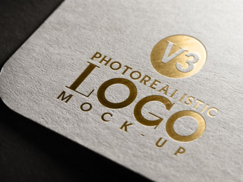
Foil is effective for luxury cues, small logos and controlled highlights. Gold is not the only answer: silver, copper, rose gold, holographic and colored foils can support different scent stories. Always evaluate the foil against the actual paper, laminate and curve.
Embossing and debossing
Relief can create a tactile brand mark without adding another color. On folding cartons, the depth and position must respect folds, glue zones and board strength. Fine serif type and shallow artwork may disappear; bold, simple forms reproduce more reliably.
Spot UV
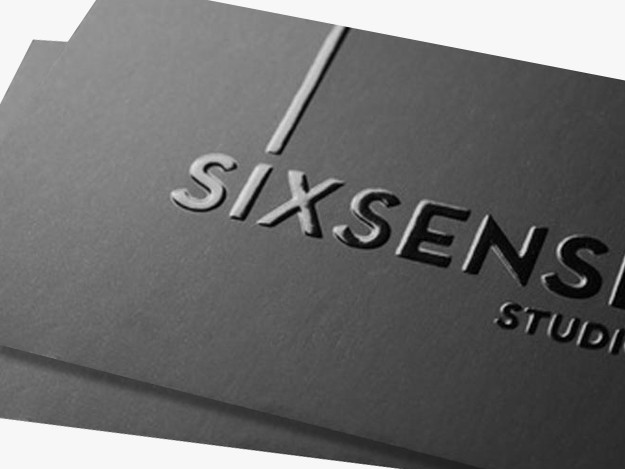
Spot UV can contrast a matte background with gloss detail. It is useful for botanical illustrations, scent trails or a tone-on-tone pattern. Registration tolerance should be considered, especially around very small text.
Soft-touch and anti-scuff finishes
Soft-touch surfaces can feel premium but may show fingerprints, rub marks or color variation on dark solids. Anti-scuff matte lamination is often a more practical choice for heavily handled black or deep-color cartons. A rub test on a real sample is more valuable than choosing from a finish name.
Pantone and process color
CMYK is suitable for photography and multi-color art. Pantone spot references are useful for core brand colors, but substrate and finish change the final appearance. A Pantone number is a target, not a guarantee that coated paper, uncoated paper, clear film and a wrapped rigid box will look identical.
Approve color by component and define acceptable visual relationships across the set.
Real Project Example: Coordinating Boxes, Labels and Paper Bags for a Miami Fragrance Client
A fragrance customer in Miami, United States, approached PrintPack360 for a coordinated set of custom fragrance boxes, product labels and paper shopping bags. His main concern was not simply whether gold foil could be added. He cared about the sharpness of the foil, the final printed color and whether all three components would look like one premium brand system.
This type of project is more complex than applying the same artwork to three surfaces. A carton, a pressure-sensitive label and a paper bag may use different papers, printing equipment, foil processes and surface treatments. The same color value or foil reference can therefore appear different on each component.
To address the concern, we used relevant previous production examples to show how foil area, paper texture, background color and finishing method affect the result. We then matched the proposed materials and processes to the client’s design rather than selecting each item independently. The comparison helped clarify which details should use hot foil, which should remain printed and how the visual hierarchy could stay consistent across the box, label and bag.
This process gave the client a practical basis for approving the direction and resolved his concerns about foil and print quality before full production. The project also demonstrates an important sourcing lesson: when several packaging components appear together, they should be reviewed as one system. A technically good label can still feel mismatched if its gold, black or paper tone is unrelated to the box and retail bag.
For similar projects, PrintPack360 recommends approving the following as a coordinated set:
- One primary brand-color reference, plus an agreed visual tolerance across different substrates
- The actual foil reference viewed on the selected paper or film
- Production-size logo details, especially thin lines and reversed text
- A physical or representative sample of the box, applied label and paper bag
- Packing sequence and contact points so foil surfaces are not scratched during assembly or transport
Compliance Copy Must Enter the Project Before Artwork Approval
Packaging suppliers can create space and reproduce approved content, but they should not invent a brand’s legal copy. The responsible business should confirm product classification, claims, warnings, languages and local-market requirements with its regulatory adviser.
For EU hazardous mixtures, ECHA states that CLP labels must be firmly attached and may require supplier information, product identifiers, hazard pictograms, signal words and hazard and precautionary statements. ECHA also explains that a Unique Formula Identifier links the marketed mixture to information submitted for poison-centre use.
IFRA Standards are another relevant input for fragrance formulation. The International Fragrance Association explains that its standards can prohibit, restrict or specify conditions for fragrance materials, while responsibility for safe use remains with the company placing the finished product on the market. An IFRA conformity document is not a substitute for finished-product classification or local labeling compliance.
For paper sourcing claims, FSC Chain of Custody is not merely a paper description. FSC explains that an on-product label depends on certified material being tracked through the chain of custody. Review the FSC Chain of Custody requirements before placing an FSC trademark in artwork.
The production lesson is to freeze regulatory content before plates, dies and foils are ordered. If text is still changing, approve structure and material first but hold final print tooling.
A Better Sampling and Testing Protocol
A screen proof answers questions about content and layout. It cannot prove adhesion, oil resistance, foil quality, structural fit or transit protection.
For a serious fragrance launch, use a staged approval process.
Stage 1: Dieline and digital proof
Confirm dimensions, bleed, copy, hierarchy, barcode placement, foil layer, white-ink layer and no-print/glue zones.
Stage 2: Material and color proof
Review paper or film, surface finish, opacity, color behavior and tactile quality. If the project uses clear film, test it on the actual filled bottle.
Stage 3: Applied label trial
Apply labels using the real process. Check bubbles, wrinkles, edge lift, readability and barcode scanning after dwell time and realistic exposure.
Stage 4: Structural sample
Pack the filled product. Check insertion, removal, closure, bottom strength, headspace, rattle and pressure points. For a gift set, turn the closed box through different orientations and confirm every component stays located.
Stage 5: Production and packing standard
Create an approved sample or signed limit sample. Define color references, defect criteria, roll labels, SKU carton marks, quantity per carton and pallet or shipping requirements.
PrintPack360 coordinates proofing, color control, inspection and export packing across custom boxes, labels and printed components. Buyers should send the real container or an accurate production sample whenever label fit or insert engineering is critical.
What to Include in a Useful RFQ
A vague request for “luxury candle packaging” produces vague quotations. A useful request for quotation should include:
- Product type: candle, diffuser, room spray, essential oil or gift set
- Filled product dimensions and weight
- Container material, finish and closure
- Box or label finished size
- Quantity by SKU, plus expected reorder quantities
- Target market and approved regulatory copy status
- Paper, board or label preference
- Required resistance to oil, alcohol, water, heat or abrasion
- Printing colors and Pantone references
- Foil, embossing, spot UV, lamination or varnish
- Barcode, QR code, UFI, lot code and date-code zones
- Roll specifications and labeling-machine requirements
- Insert and shipping protection requirements
- Destination, launch date and delivery terms
Photographs are useful, but send a dimensional drawing and print-ready artwork when available. For labels, identify the exact application panel on the container. For boxes, provide a physical product sample before final tooling.
The Most Expensive Packaging Mistakes Happen Before Printing
Aromatherapy packaging succeeds when creative, regulatory and production decisions meet early.
The common failures are predictable: artwork is approved before warning copy is ready; a paper label is selected without an oil test; a clear label is printed without white ink; a box is quoted before the filled product weight is known; a barcode is placed over foil; twelve SKUs reach production with inconsistent filenames; or a retail carton is expected to survive parcel shipping by itself.
None of these problems requires a more elaborate design. They require a better brief, a physical sample and a production partner willing to ask detailed questions.
For candle, diffuser and essential-oil brands, the real goal is not simply attractive packaging. It is a repeatable packaging system: one that presents fragrance as a desirable object, protects it through distribution, keeps required information readable and remains practical when the next scent or seasonal collection launches.
If you are preparing a new range, send PrintPack360 the container dimensions, product photos, quantity by SKU, target market and desired finish through the quotation page. The specification can then be developed around the product’s actual exposure, packing and sales conditions.
Frequently Asked Questions
What is the best label material for a candle jar?
There is no single best material. Coated or textured paper can provide a tactile premium look on a clean, dry jar. White or clear film is usually better when moisture, oil or abrasion resistance is important. The correct adhesive depends on the vessel material, coating, curvature, application temperature and filling process. Test the final label on the actual jar.
Why do labels lift from essential-oil bottles?
Common causes include tight bottle curvature, an oversized label, surface contamination, a stiff facestock, low application pressure or an adhesive that is not matched to the coated glass. An applied-bottle test after 24 hours and after temperature exposure is more reliable than a flat material sample.
Can a paper label be oil resistant?
A coating, varnish or lamination can improve surface resistance, but oil may still enter through cut edges or prolonged exposure. Paper labels should be tested with the actual fragrance or diffuser oil. For higher exposure, an appropriate film construction may be safer.
Do reed diffusers need hazard labels?
It depends on the finished formulation and target market. In the EU, mixtures classified as hazardous under CLP require applicable label elements, and some products require a UFI and poison-centre notification. The brand or responsible importer should obtain a classification and approved copy from a qualified regulatory source before artwork approval.
Is hot foil suitable for bottle labels?
Yes, when the artwork, facestock and bottle curvature are compatible. Keep foil elements clear and sufficiently robust, avoid placing delicate foil details on severe curves, and approve a physical sample. Oil or abrasion resistance depends on the complete label construction, not the foil alone.
How can a fragrance brand reduce costs across many SKUs?
Standardize the container and box structure, separate permanent branding from variable scent information, provide a quantity matrix and use consistent label dimensions. A shared master carton with SKU-specific labels or controlled artwork changes can reduce setup complexity without making every fragrance look identical.
Should the retail candle box also be the shipping box?
Usually not without testing. A retail carton is designed for presentation and light protection; parcel delivery adds drops, vibration and compression. A fragile candle often needs a fitted retail carton or insert inside a corrugated shipping mailer.
What files should be supplied for labels and packaging?
Supply print-ready PDF or Adobe Illustrator artwork with outlined or packaged fonts, linked high-resolution images, bleed, dieline, separate foil/white-ink/varnish layers, CMYK or approved spot colors and readable barcode artwork. Keep regulatory text editable until it has been approved, then freeze the final version before production.